
The Target/Schedule page displays a graph comparing your target staffing data to your schedule data.
The page displays two Utilization Alert Bars above the graph. These bars give you a quick view of staffing situations that require attention.
You should note the difference in how utilization is interpreted over the different intervals of time.
You can set the thresholds for staffing utilization on the Utilization tab of the Facility Settings page. A green bar indicates that staffing is within your organization's acceptable range. The Utilization Alert Bars use other colors to indicate when staffing utilization is outside of an acceptable range.
The following illustration shows the Utilization legend.
You can change how the graph calculates utilization using the View menu on the Target/Schedule graph options.
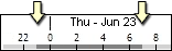
The timeline displays the day of week, date, and hour currently on display. It also marks the length of shift category partitions (SCPs) in light and dark gray, as shown in the following illustration. If you select multiple locations spanning profiles, the timeline uses the default SCP of the first profile.
The Staffing legend helps you understand what the different lines on the chart represent. The legend changes based on the option you select in the View menu of the Target/Schedule page graph options.
Selecting the option Caregivers with Util as Target/Schedule creates the graph using the number of caregivers with your selected Global Skills and calculates Utilization as the Target number of caregivers divided by the Scheduled number of caregivers.

The following table explains each section of the Staffing Legend in Caregiver view.
| Graph Line | Line Type | What It Means |
|
Demand Target |
Solid bright red line |
The graph displays Demand Target staffing as a solid red line, marking by hour the staff needed to meet patient demand for the selected Global Skills. Demand Manager calculates these values in real time based on the following criteria:
For example, if a patient is admitted at 2:34 p.m., the application assigns a Library patient progress pattern and adjusts workload to the minute, adding target staffing for the Admission time through the patient’s length of stay (LOS) based on the pattern acuity level. Likewise, when a patient is discharged at 11:32 a.m., workload for that patient increases temporarily due to the discharge process, then drops to zero when the patient leaves the unit. Demand Manager generates Target Staffing for caregivers who provide direct care and whose hours vary by the patient census. The application calculates Demand Target Staffing for each selected Global Skill in real-time as census changes, as actual and projected patient activities increase or decrease, and as patient acuity levels increase or decrease. Because Demand Manager calculates workload in real-time, it creates a more accurate view of workload than the Workload Matrices in Staff Manager Client, which use a single decision point census to define target staffing for an entire shift category partition. Demand Manager uses data entered on the Demand Settings tab of the Location Settings page and the Event Management settings for each location to generate the target staffing. See Calculating Staffing Levels in Demand Manager for more information about how the graph calculates Demand Target Staffing. |
|
Other Patient Events |
Dotted bright red line |
The dotted red line displays when the Demand target includes workload associated with one or more Other patient events for the selected skills. These are events users add to override the demand and acuity workload to more accurately capture target staffing. The application differentiates Other events from the ADT Events, which the Staff Manager registration interface manages automatically. For example, assume the target staffing for 20 patients calls for 5 RNs and 2 UAPs. Each RN will care for 4 patients; each UAP will care for 10 patients. One of the patients is at extremely high risk for a fall so it is determined that the patient will require 1:1 observation by a UAP for the duration of their hospital stay. To reflect the 1:1 need for this patient, you need to create an Other patient event that will increase the target staffing for UAPs from 2 to 3. You can position your pointer over the dotted red line to see information about the Other event. The information includes the patient's name, location, event date, caregiver skill, event type, and duration. See Using Event Management (Other Events) for more information. |
|
Scheduled |
Solid blue line |
The graph displays scheduled staff for your selected profile or profiles with a blue line. This line represents the number of staff scheduled to work (based on coverage time) by time of day for the selected Global Skills. This data is pulled directly from the schedule, reflecting the most current schedule data. If one or more profiles are selected, the scheduled staff number is the sum of the profiles. The Scheduled line is solid blue when the entire profile or profiles are selected or a dashed blue line if a subset of a profile is selected. |
|
Budgeted Target |
Solid green line |
Budgeted number of caregivers by skill from Demand Manager without ADT adjustments. The budgeted target is a variable number calculated by the application by multiplying the Demand Manager direct care hours per patient times the actual census. The staffing distribution is used to calculate the average number of care hours per day, which, when divided by the budgeted census, results in the budgeted care hours per patient day and global skill. In Demand Manager, this is multiplied by the real-time census to indicate the staffing needs if all patients were staffed at the budgeted direct care hours of the unit. |
|
36 Hour Target |
Dashed purple line |
The purple dashed line represents projected Target Staffing calculated for 36 hours from now (now being the current time, regardless of the report period selected). For time ranges from now up to 36 hours in the future, Target Staffing includes:
For date ranges more than 36 hours in the future, the target is calculated using the 6-week historical average by day of week and time of day and includes workload associated with actual demand, including actual ADT events. The impact of other events is not included in the historical average. See How Demand Manager Calculates Staffing Levels for more information about how the 36 Hour Target is calculated. |
|
Minimum Staffing Rule |
Solid dark red line |
Displays minimum staffing based on skills selected. If demand drops below minimum as set by global skill and time of day, the red line changes to dark red and tracks how long minimum staffing overrode demand. Set on the Options tab of the Location Settings page. |
|
Demand Average |
Solid black line |
The solid black line to the right of now is the retrospective demand average by day of week and time of day for the past 6 weeks. The line projects future demand based on historical data. This retrospective average can be compared the projected 36-hour target to determine if the future demand is higher or lower than the retrospective demand history. |
The following illustration shows the Target/Schedule page in Caregiver view.
Demand Manager honors minimums individually at the skill level. This can result in a Minimum Staffing Rule line that seems to go above the minimum temporarily.
In the following illustration, the graph is for a profile where the minimum staffing rule for the RN skill is two, and the minimum for the HCT skill is one. This results in a combined minimum staffing rule of three. The red circle highlights a small area that goes above the 3 minimum.
Demand Target for the RN skill is at 2.14 for a brief time from 1600 hours to 1800 hours. This is above the RN minimum.
The HCT skill is at .58 from 1600-1800. This is below the minimum.
During the brief time when the skills are combined, the Demand Target for the HCT skill is bumped up to 1 while the RN skill is 2.14, resulting in a value of 3.14 (which is above the combined minimum of 3) so the line remains dark red.
Selecting either of the two Ratio options creates the graph using the ratio of caregivers to patients. Demand Manager calculates the Caregiver to Patient ratio by dividing the number of patients by the number of caregivers at the top of each hour. For this view, Demand Manager calculates the ratio using the skill selected as the State Mandated Ratio Skill on the Location Settings page Demand Settings tab, Target and Budget Data sub-tab. The only difference between the two views is how Demand Manager calculates Utilization:

The following table explains each section of the Staffing Legend in Ratio view.
| Graph Line | Line Type | What It Means |
|
Demand Target Ratio 1:X Pts. |
Solid bright red line |
The Demand Target ratio per skill selected. Demand Manager calculates the ratio as the number of patients divided by the number of Demand target caregivers. If your selected location has a state mandated ratio and is set not to exceed it, this line will turn dark red and will not go above the state mandated ratio value. This setting is maintained in the Web in Configure Facility settings Utilization Tab. If the location does not have a state mandated ratio set, the line stays red and displays data as recorded. |
|
Other Patient Events |
Dotted bright red line |
Same as in Caregiver View: The dotted red line displays when the Demand target includes workload associated with one or more Other patient events for the selected skills. These are events users add to override the demand and acuity workload to more accurately capture target staffing. The application differentiates Other events from the ADT Events, which the Staff Manager registration interface manages automatically. For example, assume the target staffing for 20 patients calls for 5 RNs and 2 UAPs. Each RN will care for 4 patients; each UAP will care for 10 patients. One of the patients is at extremely high risk for a fall so it is determined that the patient will require 1:1 observation by a UAP for the duration of their hospital stay. To reflect the 1:1 need for this patient, you need to create an Other patient event that will increase the target staffing for UAPs from 2 to 3. You can position your pointer over the dotted red line to see information about the Other event. The information includes the patient's name, location, event date, caregiver skill, event type, and duration. See Using Event Management (Other Events) for more information. |
|
Scheduled Ratio 1:X Pts. |
Solid blue line |
Demand Manager calculates the Scheduled Ratio differently depending on whether you are viewing a period in the past or future. For past periods, it calculates the Ratio as the census divided by the scheduled caregivers per skill selected. For future periods, it calculates the ratio as the number of current patients divided by the number of caregivers scheduled per skill selected. |
|
Budgeted Ratio 1:X Pts. |
Solid green line |
Demand Manager displays the budgeted ratio by skill entered in the Budgeted Ratios table on the Location Settings page Demand Settings tab, Target and Budget Data sub-tab. When you select multiple skills, Demand Manager calculates the Budgeted Ratio as follows.
Budgeted census and ratios are date dependent. |
|
State Mandated Ratio 1:X Pts |
Solid lime green line |
This is the Nurse: Patient ratio value for your selected State Mandated Ratio Skill. You set the State Mandated Ratio Skill on the Location Settings page Demand Settings tab, Target and Budget Data sub-tab. The graph only displays this line when your State Mandated Ratio Skill is the only skill you have selected. |
|
Demand at State Mandated Ratio 1:X Pts. |
Solid dark red line |
When the demand ratio actually exceeds the state mandated ratio and the facility setting is set not to exceed the state mandated ratio, the demand graph turns dark red (replacing the solid lime green line). If a state mandated ratio is not set for a profile, the graph will not display this line. |
|
Demand Average Ratio 1:X Pts. |
Solid black line |
Demand Manager calculates this as the census at top of each hour divided by the average demand divided by the target caregivers per selected skill. The average target ratio by time of day is based on the Historical Data period and global skills you have selected. |
The following illustration shows the Target/Schedule page in Ratio view.
 Related Topics